
Slot UI kit generator: buttons, bars and plates that match the reels
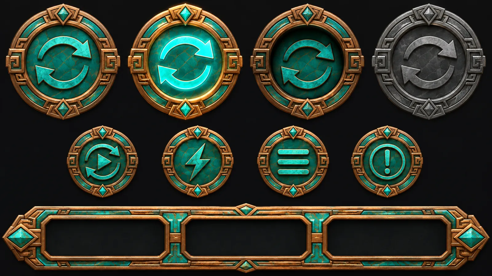
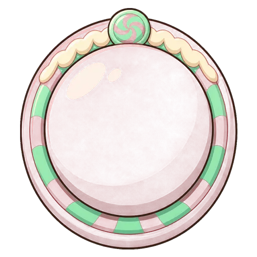
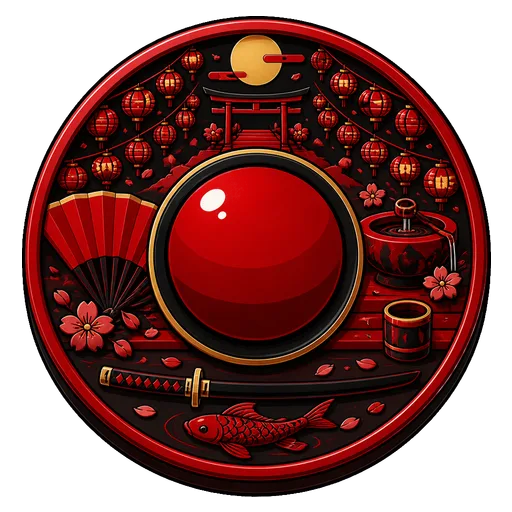
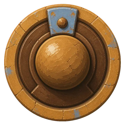
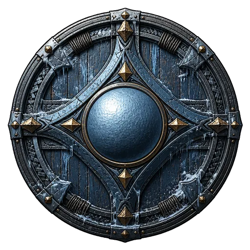
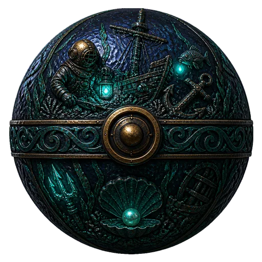
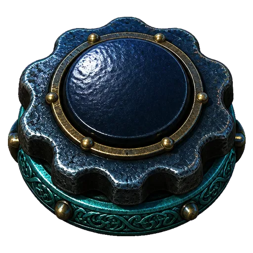
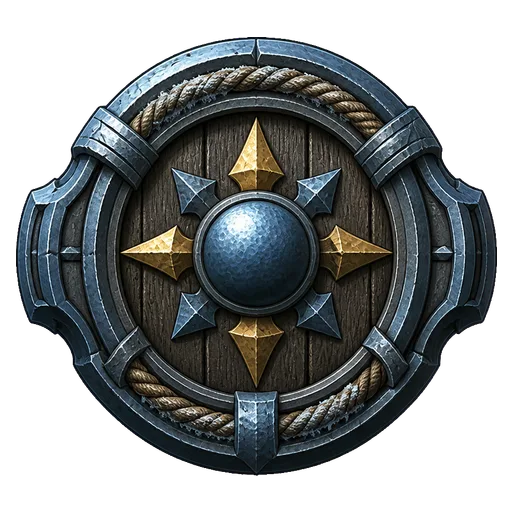
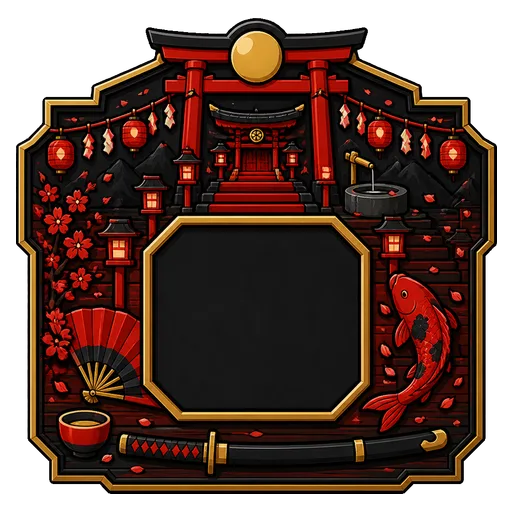
The buttons are the only part of a slot the player touches, on every spin, for the whole session. A stock UI pack usually gives itself away within a second. Its metal isn't your cabinet's metal, its light comes from the other side, and the spin button looks like it came from another game, because it did.
What the controls have to get right
Spin is the main action, so a thumb should find it without looking. Make it the biggest control, round, and the deepest in relief.
Autoplay, turbo, menu and info get used far less and mustn't compete with spin. Give each its own outer shape. Four identical discs with different icons on them are easy to mis-tap.
States matter more than they look. A button that doesn't react to hover or a press feels broken, and if the pressed art is even a few pixels off the idle art, the control jumps under your finger.
The HUD bar holds balance, bet and win, and it has to fit screens of different widths. Keep the ornament at the ends and the centre plain, so the centre can stretch without smearing detail. Plates and bars also hold numbers the client prints, which need a centre with enough contrast to read a balance at a glance.
The files
Every set includes the UI kit. Each control is themed hardware on transparency, generated against the set's style board.
| File | Size | States | Role |
|---|---|---|---|
ui/spin-button.png | 512×512 | Hover, pressed, disabled | Primary action, round and deepest in relief |
ui/autoplay-button.png | 512×512 | Hover, pressed, disabled | Secondary |
ui/turbo-button.png | 512×512 | Hover, pressed, disabled | Secondary |
ui/menu-button.png | 512×512 | Hover, pressed, disabled | Secondary |
ui/info-button.png | 512×512 | Hover, pressed, disabled | Secondary |
ui/hud-bar.png | 1200×400 | None | Balance, bet and win, nine-slice |
ui/progress-bar.png | 1200×400 | None | Empty track, nine-slice |
ui/value-plate.png | 512×512 | None | One number |
Hover, pressed and disabled are derived from each button's idle art in code and ship under layers/ui/<name>/, on the same canvas and origin as the idle file. They cost no extra generation. The two wide plates carry nine-slice insets measured from the art and published in asset-set.json, so the client stretches only the plain middle.
Two more pieces use the same hardware language. The bonus pack adds bonus/counter-plate.png, a 512×512 empty plate with a high-contrast centre for the free spins left. The front matter includes the paytable panel, an empty 1200×800 framed plate the client prints pay values into.
Why there's no text on the buttons
None of the buttons carry generated glyphs or labels. A SPIN label baked into a PNG can't be translated, and an icon drawn at 512 and scaled down to a 64-pixel button goes soft. Icons and text belong in the client, where they stay sharp and can be localised. Ship only the controls your game has real actions for.
Drawn against the same style board as the cabinet
The buttons, bars and plates use the same style board and numeric style contract as the cabinet and symbols: one key light from the upper left at 35 degrees, three value bands plus one specular cluster, and the set's palette split. They're drawn from the same named materials as the cabinet, so the two read as one piece of hardware. The preview game plays through the set's own UI kit, so you see the controls working next to the reels before you download anything. The set consistency guide explains the shared contract.
Steering the kit from the brief
Extra direction is the strongest lever for UI. That one set-wide note rides on every asset in every pack, so writing "polished jade with gold rims" there gives the buttons, the HUD bar and the bonus counter the same hardware.
The theme decides the rest: the place and its light set the colour temperature and what the controls are made of. The Style field applies one of five presets, from premium stylized 3D to clean premium vector, to the controls like everything else. The Palette field takes named colours, or stays open for the style board to choose.
Fixing one control
Every UI source can be redrawn with a note for that control only, like "deeper rim on the spin button" or "plainer centre on the HUD bar". The redraw builds a candidate beside the current image while the accepted set stays as it is, and the states are derived again from the new art. One game is $19 with ten redraws, and 100 more redraws are $10.
To start, open a new game with a name and a theme. Every game in the showcase plays through its own generated controls. The slot game asset checklist lists every control and state file, and the win banners in the same hardware language are on the slot win screen generator page.
Questions
- Can AI generate slot game buttons with hover and pressed states?
- Yes. Each button is generated once in its idle state, and the hover, pressed and disabled versions are derived from that art in code. They ship under layers/ui/<name>/ on the same canvas, so they line up exactly with the idle button.
- What size are slot UI buttons?
- Each button is a 512×512 transparent PNG. The HUD bar and progress bar are 1200×400, and the value plate is 512×512.
- Do the generated slot buttons include icons or text?
- No. The buttons are told apart by their outer shape. Icons and labels go in on the game client, where they stay sharp at any size and can be translated.
- How do I stretch a slot HUD bar to a different width?
- The wide plates have ornamented ends and a plain centre, and their nine-slice insets are measured from the art and published in the manifest. The client stretches the centre and keeps the ends at their drawn size.